Stock-specific analysis
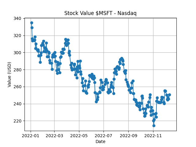
Image 1 and 2 are the results for the analysis of the MSFT (Microsoft) stock


Image 3 and 4 are the results for the analysis of the UPS (United Parcel Service, Inc.) stock


Image 1 and 2 are the results for the analysis of the MSFT (Microsoft) stock


Image 3 and 4 are the results for the analysis of the UPS (United Parcel Service, Inc.) stock


Image 1 is the result of the best performer over a year in both markets
Image 2 is the result of the worst performer over a month in the New York Stock Exchange (NYSE)
Image 3 is the result of the most stable stock over a day in the Nasdaq


Image 1 is the analysis during the covid pandemic
Image 2 is the analysis during the 2008 financial crisis


The results showed previously are obviously not the the only ones available, there are many more options to choose and stocks to explore.
One of the main challenges we faced in the begining was the handling of the many files to analyse with the different spark models (rdd, df) so we had to improve our skills and discover new methods of spark to deal with this kind of situation. For example the manipulation of columns and rows (merging days of the same month or year, deleting unused columns, etc...)

As a final thought on the current state of the project, we completed the most important goals of ours, which were to make a tool with good user interface that offers a lot of options for the user to look at stock market statistics.
